
Spring 2026's 4 Color Trends — and What We're Wearing Them With
Every spring season produces a long list of "colors of the year" that mostly amount to noise. This one is different — not because the colors are surprising, but because they're actually wearable together. Spring 2026 landed on four shades that work across silhouettes, price points, and real-life occasions. We've been tracking them since the February shows, and we're confident enough to tell you which ones earn closet space and which ones you can skip entirely.
How we picked these four (and left the rest behind)
The Pantone Color Institute releases its seasonal forecast, runway editors compile their own lists, and somewhere in between, a handful of shades actually make it onto real bodies. We track which colors show up across multiple price tiers — from the runway to the mid-market — because that's the signal that a trend has legs. A color that only appears in a $3,000 runway look isn't a trend. It's a mood board.
These four passed that test. They appeared at Jacquemus, Zimmermann, and Reformation-adjacent contemporary labels in February, and by March they were showing up in street style from Copenhagen to Austin. According to Pinterest Trends data, searches for "butter yellow outfit" increased 210% year-over-year in the first quarter of 2026 — the biggest single-color search surge since sage green peaked in 2022.
The colors we left off: coral (too close to terracotta to justify a separate category), lavender (still trending but peaking — we'd buy it in a basic silhouette only), and anything described as "digital" or "electric." Those live in editorial shoots. They don't live in most closets.
Butter yellow — the neutral that isn't
Butter yellow sits at the intersection of warm white and pale gold. It reads as a neutral from a distance and as a color up close — which is exactly why it works so well as a dress shade. It doesn't compete with skin tone the way a saturated yellow does. It flatters warm, cool, and neutral undertones equally, which almost no yellow manages.
The fabric matters here more than usual. Butter yellow in a stiff polyester reads cheap fast. The same shade in a soft cotton or linen drapes with enough movement that the color reads warm rather than washed out. We'd point you toward linen dresses first — the natural texture of linen gives the color depth that a flat weave can't.
What to wear it with: white leather sandals (not beige — white creates contrast that grounds the look), gold jewelry only (silver cools the shade down too much), and a tan or cognac bag. Avoid black accessories — they pull the yellow toward green in photographs.
The silhouette that carries butter yellow best: a relaxed midi dress with a smocked or elasticated waist. The gathered fabric creates shadow and dimension that flat yellow needs. A tight bodycon in butter yellow is a harder wear.
"Butter yellow is doing what sage green did in 2022 — it's becoming the new neutral for people who find beige too flat. The difference is it photographs warmer, which is why it's everywhere on social right now."
— Maya Okonkwo, Livostyle Trend Editor
Dusty cerulean — the blue that replaced navy
Navy has been the safe blue for so long that it stopped feeling like a choice. Dusty cerulean — a blue that sits between sky blue and slate, with a slight grey undertone — is what navy dressers reach for when they want something with more personality but still want to feel grounded.
It's showing up most convincingly in satin and silk-adjacent fabrics, where the dusty quality of the shade gets amplified by the sheen. A matte cerulean reads flat. A slightly lustrous cerulean reads expensive. This is one of the few spring trends where we'd actively recommend spending a little more on fabric quality, because the difference between a $35 and a $65 version of this color is visible.
What to wear it with: nude or blush accessories, not white. White next to cerulean reads clinical. Blush softens the grey undertone and pulls the look warm. For shoes, a nude pointed flat or a low block-heel sandal. For jewelry, silver works here — it picks up the cool grey in the shade without fighting it.
Best silhouettes: satin slip dresses, midi skirts paired with a white or cream top, or a relaxed button-down blouse tucked into wide-leg trousers. The color does the work — the silhouette just needs to stay clean.
One occasion where cerulean is specifically right: wedding guest. It's distinct enough to photograph well in a group, and it avoids the white/ivory zone entirely. For spring garden weddings in particular, dusty cerulean reads more considered than the standard blush or sage. Browse our wedding guest dresses for current options in this color family.
Warm terracotta — still here, still earning it
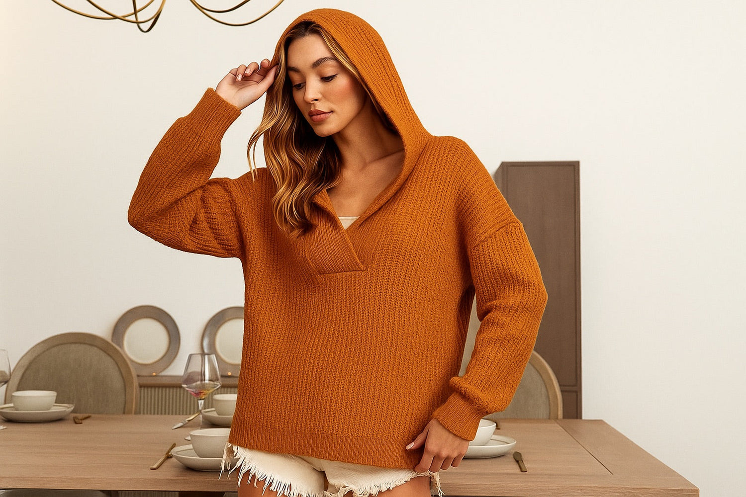
Terracotta has been declared "over" twice in the last three years. It keeps coming back because it works — specifically, it works on a wider range of skin tones than most warm colors, and it photographs beautifully outdoors. The 2026 version is slightly more orange than the muted clay tones of 2023 and 2024. Think fired pottery rather than dried mud.
This season's terracotta lives in ribbed knit fabrics more than anywhere else. The texture of a ribbed knit in terracotta creates the kind of tonal depth that makes the color look intentional rather than trendy. Ribbed knit dresses and tops in terracotta are the most consistent sellers in this color category right now, and the ribbed texture also holds the shade well after washing — flat jersey terracotta fades faster.
What to wear it with: cream or off-white on top if wearing terracotta on the bottom, or terracotta head-to-toe if the silhouette is simple (a matching two-piece set works well here). Avoid brown accessories — too close in tone. Instead: camel, gold, or a pop of white. White sneakers with a terracotta midi dress are one of the cleaner casual looks this spring.
Terracotta is also the easiest of the four colors to transition into summer. It reads warm-weather without being a beach color, which means it works for late-spring occasions — graduation, Mother's Day, a rooftop dinner — that other seasonal colors don't quite land for. See our graduation dresses and date night dresses for terracotta options across silhouettes.
Soft mint — the freshest entry this season
Mint has appeared on spring runways before, but it's always felt slightly costume-y — too close to a pastel Easter palette to feel modern. The 2026 version is different. It's been desaturated enough that it reads almost as a cool neutral, closer to pale sage than to the bright mint of the early 2010s. The result is a color that feels genuinely fresh without demanding attention.
It works best in lightweight, textured fabrics: smocked cotton, eyelet, or crochet. The texture breaks up the flatness of the pale shade and gives it visual interest. A smooth, flat mint fabric can read clinical. A smocked or eyelet mint dress reads like it belongs at a garden party or a brunch in the sun. Browse smocked dresses for the silhouettes that carry this color best.
What to wear it with: white is the obvious pairing and it works, but the more interesting choice is cream or natural linen tones. Cream warms the mint up slightly and makes the combination feel less expected. For accessories: gold jewelry, tan leather sandals, and a woven or straw bag. This is the one color in this season's edit where a hat actually adds to the look rather than competing with it — a wide-brim natural straw hat with a mint smocked dress is a complete outfit.
Mint is also the most occasion-specific of the four. It's a brunch color, a garden party color, a beach-adjacent color. It doesn't cross into evening as easily as cerulean or terracotta. If you're buying one piece in this shade, make it a summer dress you'll reach for on weekends rather than a piece you're trying to wear to the office.
How to mix all four without looking like a paint swatch
The good news: all four of these colors share a warm-to-neutral undertone quality that makes them compatible. None of them are saturated primaries. They can be worn together in a single outfit — carefully.
The rule we follow: one color as the dominant piece (usually the dress or the bottom), one color as a small accent (a bag, a shoe, a scarf), and neutrals everywhere else. Butter yellow dress with a terracotta bag and white sandals. Cerulean midi skirt with a mint-striped blouse and nude flats. These combinations work because the colors are related in temperature without being identical.
What doesn't work: two of these colors in equal visual weight. A cerulean top with a terracotta skirt and a mint bag is three competing statements. The eye doesn't know where to go. Pick one to lead, let one accent, and let neutrals do the rest.
For building a small spring color capsule, we'd suggest starting with two of the four — whichever two overlap most with what you already own. If your closet skews warm (lots of brown, camel, cream), start with butter yellow and terracotta. If it skews cool (navy, white, grey), start with cerulean and mint. Either pairing gives you enough range to cover most spring occasions without buying a full new wardrobe.
Browse the full spring collection to see how these colors are landing across dresses, tops, and sets right now. For specific silhouettes, our floral dresses and two-piece sets are carrying the strongest color stories this season.
Frequently asked questions
What are the main spring 2026 color trends?
The four colors with the most runway-to-real-life traction in spring 2026 are butter yellow, dusty cerulean blue, warm terracotta, and soft mint. Each works differently depending on fabric and silhouette — butter yellow in linen and cotton, cerulean in satin or silk, terracotta in ribbed knit, and mint in smocked or eyelet cotton.
Which spring 2026 color is easiest to wear if you're new to color dressing?
Butter yellow. It reads as a warm neutral from a distance and flatters a wider range of skin tones than most yellows. Pair it with white sandals and gold jewelry and the color does the work without requiring any complicated styling decisions.
Can I wear terracotta to a spring wedding as a guest?
Yes — terracotta is a strong wedding guest choice for spring. It's warm, photographs well outdoors, and sits well away from the white/ivory zone. For a garden or outdoor wedding, a terracotta midi dress with gold accessories and nude or camel heels is a complete and occasion-appropriate look.
How do I style mint green without it looking too pastel or juvenile?
The key is fabric texture and accessory tone. Mint in a smocked, eyelet, or crochet fabric reads more sophisticated than mint in a flat jersey. Pair it with cream rather than white (warmer and less expected), gold jewelry, and tan leather sandals. Avoid pink accessories — they push the combination toward a pastel palette. Keep the silhouette clean and the mint will read fresh rather than sweet.
Is cerulean blue appropriate for a work or office setting?
Yes, in the right silhouette. A dusty cerulean midi skirt with a cream blouse and pointed flats reads polished and office-appropriate. A cerulean satin slip dress is an evening piece — the fabric shifts the formality. For office wear, stick to matte or semi-matte fabrics in this shade and keep the silhouette structured.